
- Home
- Brand on a page
Brand on a page
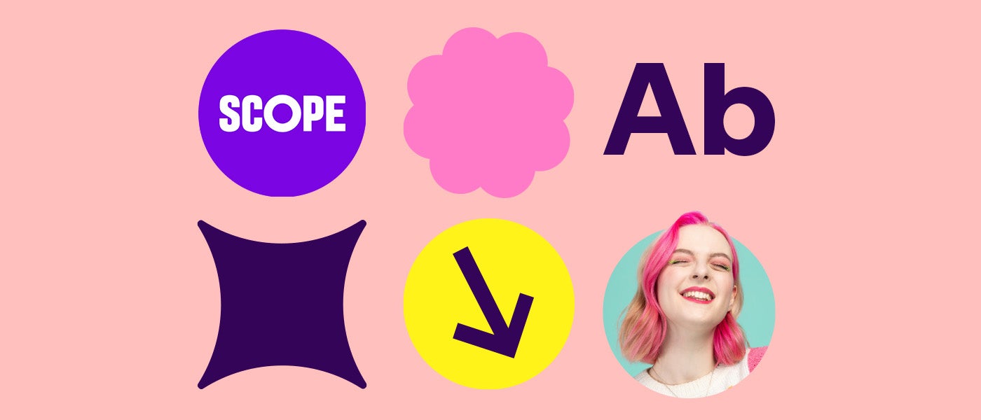
Scope’s brand on a page
Questions? brand@scope.org.uk
Everything you need to make something that looks and sounds like Scope: who we are, how we speak, and how to use our logo, colours, photography, type and graphic elements accessibly. Use these three elements together to make Scope instantly recognisable. What we look like Each colour shows its values for screen (HEX, RGB) and print (CMYK), and the text colour to use on it, with its contrast ratio. Scope Bright Purple Hero brand colour Use White text: 7.08:1, AAA Deep Purple Text and high contrast Use White text: 16.10:1, AAA Scope Yellow Accent and direction Use Deep Purple text: 13.86:1, AAA Scope White Clean backgrounds Use Deep Purple text: 16.10:1, AAA Bright Mint Accent Use Deep Purple text: 11.76:1, AAA Bright Pink Vibrant accent Use Deep Purple text: 6.83:1, AA Pale Lemon Light tint Use Deep Purple text: 15.35:1, AAA Light Mint Tint accent Use Deep Purple text: 14.07:1, AAA Blush Pink Soft tint Use Deep Purple text: 10.37:1, AAA We use three styles of photography. Labil Grotesk is used for titles, it’s our hero typeface and used with narrow line spacing Hargreaves Heavy is for subtitles within body copy Hargreaves Regular is our typeface for body copy Arial Bold is our system font for titles Arial Regular is our system font for body copy Lozenges hold calls to action. The examples below are illustrations, not working buttons. Write in 14pt or larger, left aligned. On screen, 14pt is about 19px. Keep text left aligned, never justified. Colour contrasts of 4.5:1 plus, ideally 7:1 plus. Including on photo backgrounds. Use icons when they serve a clear purpose. 2pt keyline on infographics. Who we are
Who are we
Scope is the UK’s leading disability equality charity. What do we do?
We’re here to create an equal future with disabled people. To change attitudes and break down barriers. How do we do it?
Scope’s core identifiable elements
 Scope Bright Purple
R123 G5 B226
C75 M94 Y0 K0 Logo


Colours
Primary colours
Secondary colours
Check a colour pairing
Choose a text colour and a background colour to see if they pass. Photography


Typography
Icons


Flourishes

Action lozenges
Campaign with us Campaign Amplification circles
Impactful statements or titles.

Keep it accessible
AA needs 4.5:1 for body text. AAA needs 7:1. All pairings above pass AA; aim for AAA.
Text on background Contrast Passes Scope White on Scope Bright Purple 7.08:1 AAA Deep Purple on Scope White 16.10:1 AAA Scope Bright Purple on Scope White 7.08:1 AAA Scope White on Deep Purple 16.10:1 AAA Scope Yellow on Deep Purple 13.86:1 AAA Bright Mint on Deep Purple 11.76:1 AAA Bright Pink on Deep Purple 6.83:1 AA Pale Lemon on Deep Purple 15.35:1 AAA Light Mint on Deep Purple 14.07:1 AAA Blush Pink on Deep Purple 10.37:1 AAA Deep Purple on Scope Yellow 13.86:1 AAA Deep Purple on Bright Mint 11.76:1 AAA Deep Purple on Bright Pink 6.83:1 AA Deep Purple on Pale Lemon 15.35:1 AAA Deep Purple on Light Mint 14.07:1 AAA Deep Purple on Blush Pink 10.37:1 AAA 